Media World, Part 1: Let Us See How the Sausage is Made.
The sausage ends up on our table. We might feel better if we know where it came from. Or maybe worse. But more informed either way.
The Stephen Frank market in Washington D.C., a century ago. Don’t worry, I’ll be talking about metaphorical sausage from this point on. (Library of Congress.)
This post is about a simple reality of the media world that seems obvious but has some surprising consequences.
The simple reality is this: how a story is presented can matter much more than what the story says. That part may be obvious. My point for now concerns the mismatch between the crucial importance of this step in the journalistic process—the decisions about play, presentation, and “framing” of a news story—and how opaque and unaccountable the process is to the outside world.
—At the grand scale, everyone knows who is ultimately responsible and perhaps accountable for decisions by a news organization. The names of the editors and publishers are there in the masthead. Usually we know about the owners too.
—At the granular level, everyone knows who reported and wrote a specific story. The names are there in the byline—as are the credits for photos, charts, illustrations, research help.
But in between is a black box. We generally have no idea who chose the page layout, who wrote or approved the headlines, who decided on the summary for the subheadline (known as the subhed or dek), who decided how to promote the story on social media.
Those decisions really matter. And it would matter for news organizations to expose them to more light.
Selling the Sizzle, and the Steak.
Reporters work hard. They—we—can toil for days to get the right detail, the right context, the right quote or anecdote. Think of movies from All the President’s Men to Spotlight or She Said that have dramatized this effort.
But after all that sweat and trouble, for most stories, most of the time, what most readers will notice is the headline on the reporter’s article, the chart or photo, or the summary in the dek or a Tweet. Some readers might register a story’s placement on the page, either in print or online. Then they—we—move on.
We move on because we have to. So much information, so little time. You can read a few stories to the end but must pass over many others of equal worth.
And we are comfortable moving on because over the centuries, through constant shifts in technology, the news industry has developed such sophisticated cues to signal what might matter, and why.
The subtle body-language of the printed page.
The printed-news page now seems to epitomize old-tech. But it embodies a subtle meta-language in which headline size, story length, graphic features, and other elements tell a story on their own. The layout of most web pages builds on these same print-world signals and cues. You glance at a page and get the idea, even if you don’t read a single word that the reporter agonized over. You notice the sizzle even if you don’t have time to try the steak.1
The skills that go into layout, summary, and presentation are themselves formidable. Headline writing is its own special art. The “social sell” for a story via Tweets etc. is also an evolved skill. All of these judgments are being made under deadline pressure. Yet from the outside world’s perspective, this is happening inside a black box.
What comes out of the box? The famous Gallup word-cloud from the 2016 election, which you can see here or and which I wrote about here, showed that far and away the main thing voters had “heard or read” about Hillary Clinton during the campaign was “email,” whereas for Donald Trump it was “border,” “immigration,” “speeches,” and so on. It’s not that any one news story talked excessively about the Clinton email “issue.” It’s that the subject was so relentlessly presented, through cues we all understand, as the most important thing to know about her.
What are some illustrations now? Here are five—with two caveats.
—First, where feasible, I’ve cropped the reporters’ bylines from these stories. That’s to make clear that I am not talking about what the reporters put into their accounts. Rather this is about the other ways in which news organizations send their signals of what matters.
— Second, these screenshots are all from the New York Times. That’s because the Times is the most influential news organization in the country, with such a steering influence over the rest of the industry. And, as I’ve written many times, the Times is such a daily miracle of scope, reportorial effort, comprehensiveness, and other virtues that its questionable judgments stand out all the more.
1) ‘Momentous Scene’
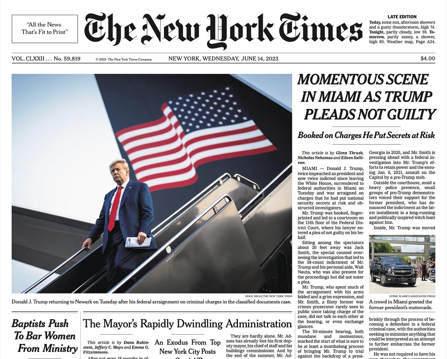
Here was the front page of the Times the day after Trump had his first arraignment on federal charges, the one for mishandling classified documents in Florida.
The articles, read to the end, describe Trump’s mounting legal jeopardy.
But a glance at the page might tell you a different story.
How did the paper decide to use that image of Trump—stern and resolute, (painted) flag flapping behind him, getting off a plane that is not Air Force One but looks as if it could be? And decide that “Momentous Scene” and “Pleads Not Guilty” were the crucial shorthand messages to convey? To put it crudely, would Donald Trump himself have chosen any other layout for that front page?
People at the Times must have argued over these choices. It would be useful to know what the arguments were.
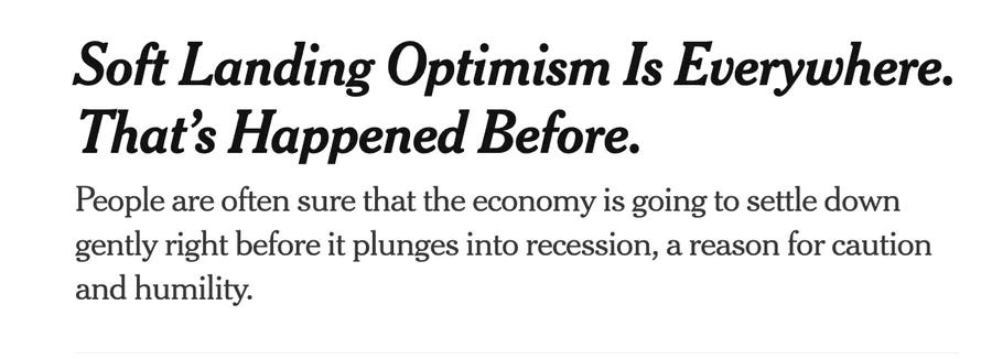
2) If the economy is ‘good,’ why do we feel ‘bad’?
This pattern in recent news—downbeat media talk about an overall upbeat economy—is now widely discussed. For example, by the NYT’s own columnist Paul Krugman, here.
But the downbeat framing continues. Here are a few recent examples, again all from the Times:
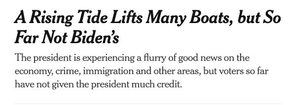
And, for the political ramifications:
Again the point is not about the articles, which go into pro-and-con nuances. It’s what you would assume from glancing at the page. And on the layout someone decided on.
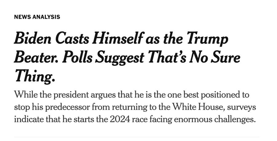
3) ‘More bad news for Biden.’
The famed Tweet stream from ‘NYT Pitchbot’ is built on a standing joke: anything that happens can be framed as bad news for Joe Biden. Here are two recent examples of that joke come to life:
As someone noted on Twitter, suppose this headline had been reversed: “Despite Divisions, Successes at NATO Summit.” That would convey a quite different message—and, as it happens, would be more in keeping with the story itself.
4) ‘Dems in Disarray’
Here are two NYT front pages, four years apart. Each appeared just one day before that year’s midterm elections.
Here’s what you could see if you blew those pages up to full scale:
On the left is the front page from November 5, 2018. Its lead story is headlined “Edge in Polls Might Not Tip House Scales.” That is: Democrats should be nervous. The story itself reported a poll showing the two parties “essentially tied” in 30 crucial toss-up Congressional districts.
The very next day, voters went to the polls and gave the Democrats a huge mid-term victory, including a gain of 41 (!) seats in the House.
On the right is the front page from November 7, 2022—last fall. Its headlines and deks said Democrats were “bracing for losses,” with their party’s president unpopular and their outlook “bleak.”
The very next day, voters went to the polls and, contrary to “red wave” forecasts, gave the Democrats two more governorships plus one more seat in the Senate, and confined the GOP to a near-record-low midterm gain of five House seats.
The question is not why the forecasts were so far off, one day in advance. That’s the new normal. Rather it’s the process and choices that led to framing the two parties’ prospects this way.
5) ‘Free speech’ vs lies.
Here is an interesting one. It’s the NYT’s presentation last week of Trump’s defense to his January 6 indictment. On Trump’s side, the Times gives us “free speech”—but without quotation marks. On the government’s side, “lies,” placed in what look like air quotes.
When I first saw this, I immediately took ‘lies’ as air quotes, and did a Tweet-thread to that effect. Why was the Times, which had generally resisted using “lie” in its news stories, signaling its distance from the term? Why was it presenting the preposterous “free speech” line from Trump without quotes and thus presumably at face value?
Many people apparently read the story’s framing just as I had. But I started hearing from a number of reporters and editors, including some from a publication I won’t name, saying that the Times had put lies in quotes because that’s what Jack Smith’s team had literally “called out” in the indictment. They said it was meant as a “real” quote, not the mocking version.
I think that’s a weak argument. Number one, I don’t think that’s how most readers would take it. Number two, by exactly that same logic “free speech” should be in quotes as well, since that’s what Trump and his lawyers actually said.
But at least it’s an argument. It’s not defensiveness, or haughty silence—which are the worst ways for the media (or anyone) to meet questions about their judgment calls.
It’s the kind of call a Public Editor might have asked Times editors about, if the Times had not abolished that position. NPR, to its credit, still has that role, and Kelly McBride uses its powers.
More to come in Part 2.
An example: Think of movies in which a newspaper page plays a dramatic role. You can go all the way back to Citizen Kane, but it was true even with the recent She Said. Most of the time, it’s the page and headline itself, not anything in the story, that propels the narrative along.







I recall how sausages were made from Upton Sinclair’s THE JUNGLE, which described the entire gruesome process, including a Lithuanian’s wedding ring in the product. [Highly effective account while total fiction—started as article in socialist newspaper, then expanded into book. Included in the historiography of the Muckrakers.]]
From this flowed the maxim: ‘There are two things you don’t want to know—how sausages and laws are made.’ Jim’s article about the innards of the newspaper business for me touches on glorious BBQ as well as ‘Lithuanian sausage.’
At 89 I have observed a broad range of the good, bad, and ugly in newspapers here and abroad. The best has been and remains magnificent. I recall when the Philadelphia Inquirer was receiving Pulitzer Prizes. Alas, today it, like NJ’s Star-Ledger, is best used to wrap fish.
Still, I am breathless at some investigative reporting by The New York Times, The Washington Post, The Wall Street Journal, ProPublica, The Economist, and others, as well as FrontLine. All this occurs within an environment in which news has become entertainment, many hundreds of newspapers, large and small, have disappeared, and advertising [traditionally 70% of a newspaper’s space] has continued to shrink.
One of the largest newspaper potholes is local reporting. I observed this first hand while serving my local government for 15 years. I only recall one reporter who was aware of the Municipal Land Use Laws, as he reported on complex planning and zoning discussions. Often these local reporters turned over rapidly as the scope of their shallow coverage expanded. They tended to highlight the most strident (and misleading) comments from public meetings in reportage that was distinguished by its inaccuracies.
Good news appears most often in local newspapers—on the sports pages and highlighting some individuals and organizations that deserved recognition. I recall, some years ago, the GOOD NEWS WEEKLY, which disappeared because ‘good news’ doesn’t sell. If you look closely in THE WEEK MAGAZINE, there is a small column of ‘good news’ weekly. The closest to a ‘nice news’ daily was THE CHRISTIAN SCIENCE MONITOR, which is no more.
I recall the song Don’t You Bring Me No Bad News.. In journalism today a modern-day rendition could be Don’t You Bring Me No Good News. The economy is an excellent example. Who can tell, from the plethora of ‘Chicken Little’ articles that the Biden economy has been doing surprisingly well? Only those diligent readers who spelunk in Paul Krugman’s columns and The Economist.
I lament the rocky road of newspapers. Still, I applaud those reporters, as reflected by such THE WASHINGTON MONTHLY alumni as Jim Fallows, who are the nobility of their profession. “Social media’ has scant time for serious reporting. Kudos to those reading and thinking subscribers to Jim Fallows and Heather Cox Richardson’s Substacks.
Still, for those who seek good, bad, and ugly news, there are marvelous sources, including some that I have already mentioned, The Atlantic, The Guardian, and (deep breathe), the New York Review of Books.
Despite my laments, I hail those who deserve to be in the Pantheon of Excellent Journalists, of whom Jim Fallows and Charlie Peters are charter members.
Well, maybe I am a bit simple minded, but if I didn't know any better I'd say the NYT doesn't like Democrats very much.