Two New Maps to Notice
Additional tools for thinking globally and acting locally. Plus, they're interesting.
My purpose today is to introduce two new maps that deserve attention.
They’re different in their subjects, scale, approach, and ambition. But each highlights an augmented way of thinking—and feeling, and learning, and telling—about our world. Each applies technology in a way others can learn from and apply. And each is just interesting.
1. The sea turtles of Manasota Key.
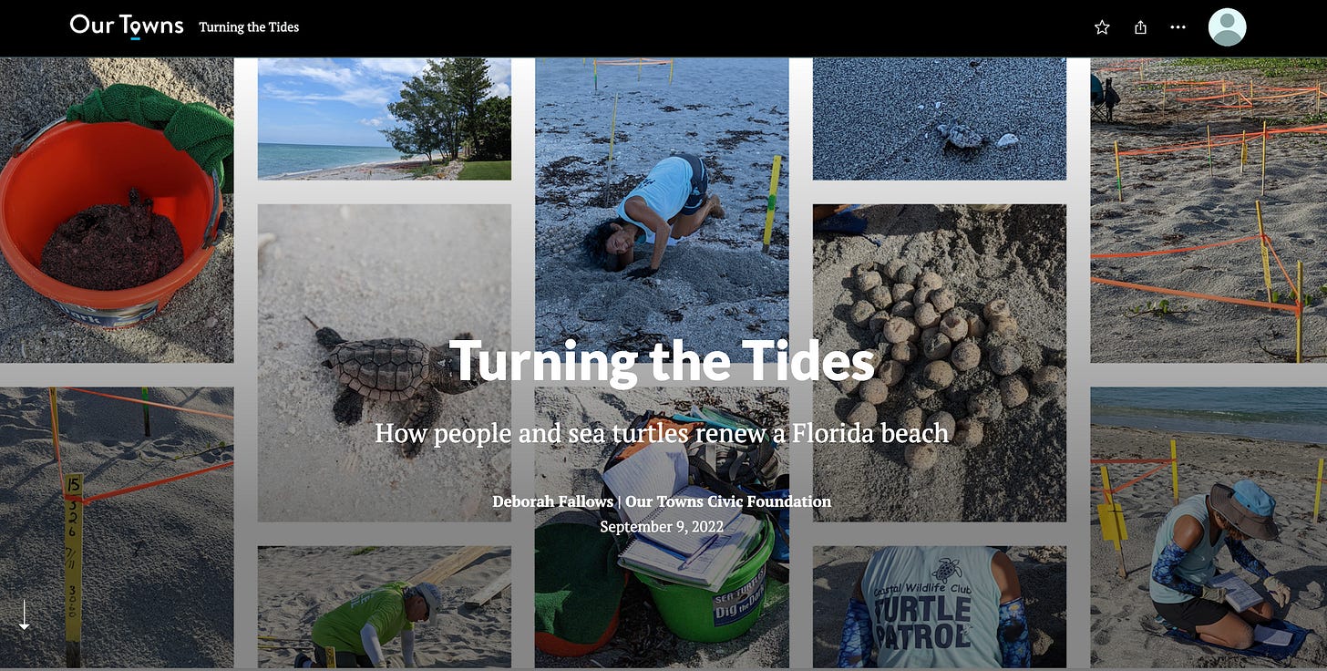
This past week my wife, Deb Fallows, and our Our Towns colleague Michelle Ellia published a “Story Map” about the work of members of the “Turtle Patrol” of Manasota Key, a 14-mile long scenic beach strip on the Gulf Coast of Florida south of Sarasota.
You can read their post about the story map here, which contains links to the story map itself. Here is a screenshot of its opening view:
Story mapping technology, developed by our longtime friends and partners at the digital mapping company Esri, is an innovative and lively approach to presenting stories on several levels at once.
I am avoiding the better-known but jargony term “multi-media journalism,” but that’s essentially what we’re talking about. Story maps combine words, pictures, videos, sound, and of course geographic references to depict reality and shape understanding. I wrote a detailed article about story mapping several months ago, and I’ve long promoted the term “geo-journalism” for map-based story-telling. (For the record, Allen Carroll and members of his story mapping team at Esri have advised and supported us in developing these and other maps and in “geo-journalism” in general.)
One of the easiest ways to grasp the story map approach is to look through this new turtle map by Deb and Michelle. You start at the top, scroll down, and see the sequences of images, words, maps, and ideas.
Near its end it includes a 3-minute YouTube video by Robert Kraft of Florida, embedded below. I think that if you start through the story map you’ll keep going. I think you’ll want to see the whole YouTube video as well. Please give them a try. (You’ll notice a charming “hand of God” moment at time 1:45-1:55 of the video.)
2. ‘Climate Mapping for Resilience and Adaptation’—a brand new public resource.
During the summer I wrote about the debut of Heat.gov, a new federally run site that presents crucial information about rising temperatures. Through the map, you could see heat forecasts for this afternoon—and for 50 years from now. You could see how temperatures were changing on the continental and global scale, and how they were affecting your own community.
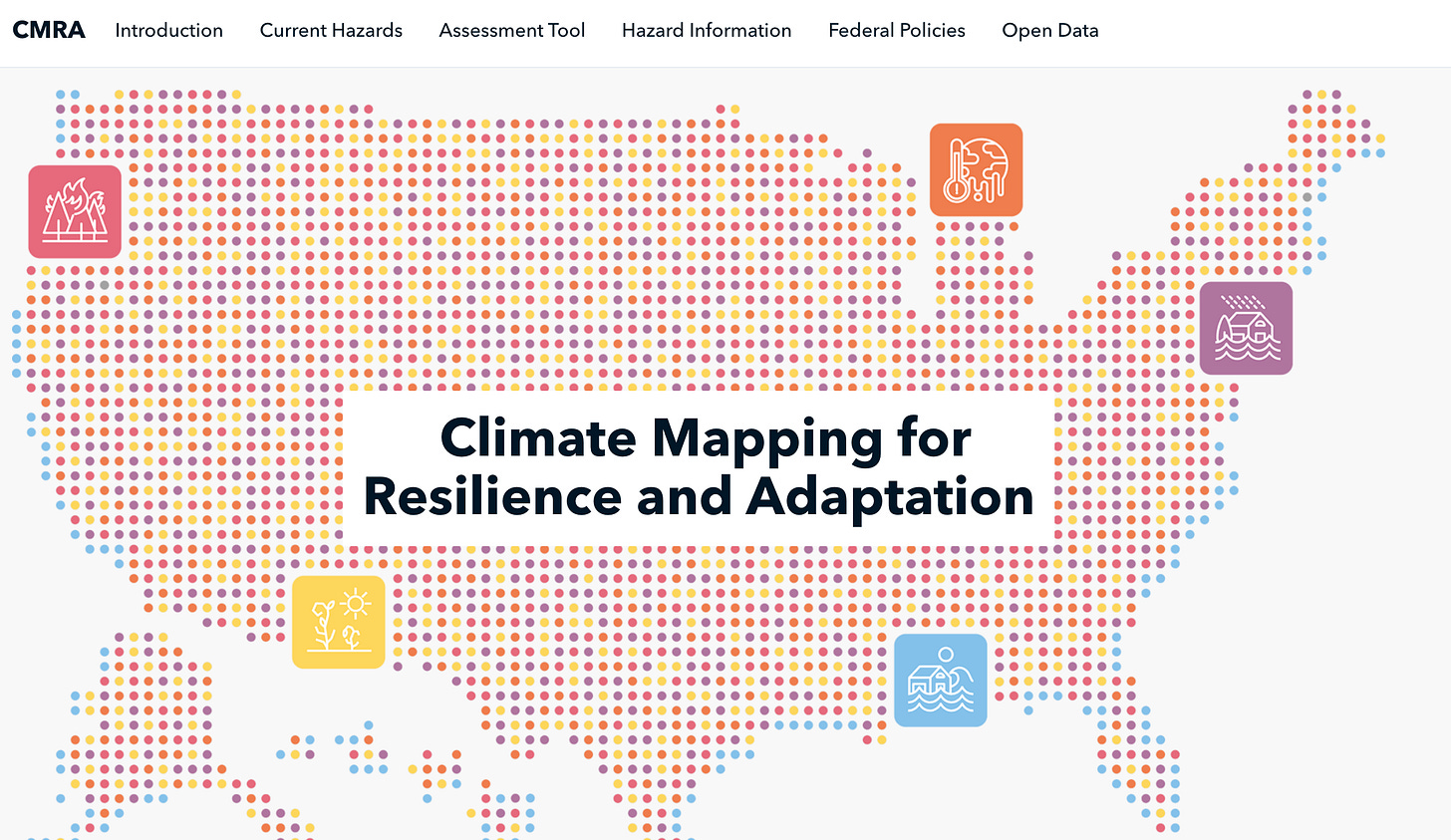
Two days ago, at a virtual White House briefing, the Administration unveiled a much broader version of a similar approach (also using Esri technology). It has the less catchy if more technically descriptive name Climate Mapping for Resilience or Adaptation, or CMRA. “Camera, as we call it,” the head White House climate-policy advisor, David Hayes, said in the briefing. The session also included Richard Spinrad, the head of NOAA; Kate Gallego, mayor of Phoenix; and Daniella Levine Cava, mayor of Miami-Dade County.
The easiest way to understand what the CMRA portal does is to prowl around on its site. I cannot recommend that highly enough, for reasons that I’ll summarize below—after two screen shots.
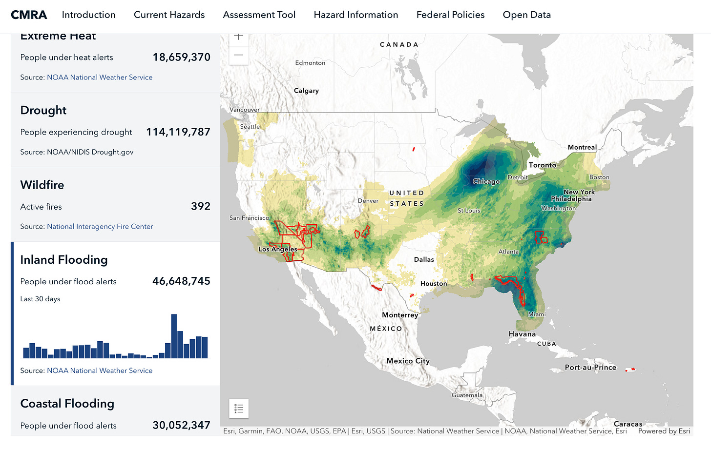
First, for a real-time alert of inland flooding danger, here is the projected extreme-rainfall accumulation over the next 72 hours as I write. The darkest blue on the map indicates accumulations of more than 10 inches. The red areas indicate active flooding watches, warnings, or other advisories:
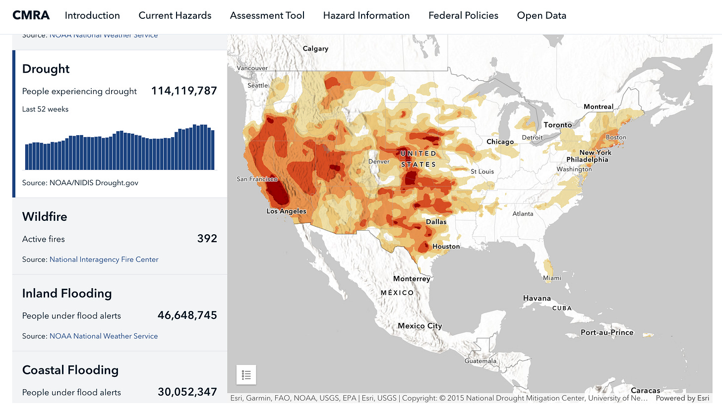
And, for comparison, here is the current nationwide drought status:
What makes this different.
We’ve seen some maps like these before. Here are some things that make this new presentation significant:
—Its sweep and comprehensiveness. Heat.gov was all about the effect of rising temperatures. This new climate portal replicates what, for instance, the National Weather Service has done with weather.gov, in combining in one place many aspects of climate-related changes.1
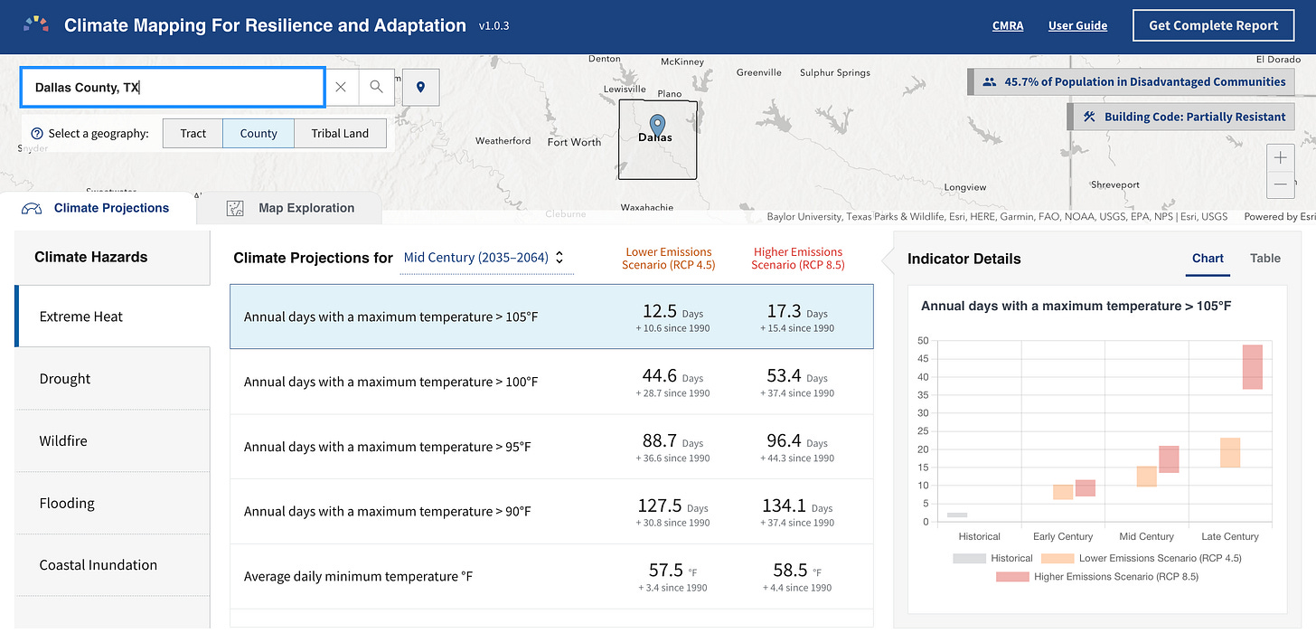
—Its multiple time scales. You can use this map to see: What is happening right now. What very likely will happen in the coming week. What probably will happen in the coming decade. And what could happen, for better or worse, through the rest of this century, depending on “high-emission” or “low-emission” scenarios. For example, here are projections of temperature possibilities through the rest of the century for Dallas. The bar graph on the right shows deviations from baseline conditions in Dallas as of 1990.
—Its multiple geographic scales. It starts with the big picture, globally and nationally, and then can focus in wherever you would like. You can get a version of that Dallas chart for any community or county or tribal area in the nation, for any of the climate-effect variables, for any time horizon in this century.
—Its practical orientation. As the mayors and federal officials alike stressed at the briefing, the purpose of the portal is to help communities and states prepare. It depicts where climate effects overlap economic and racial disparities. It gives a sense of which changes are most urgent in which places. Also it catalogs federal programs or grants that might apply to local resilience projects.
David Hayes put it this way at the start of the press conference.
The administration has designed this climate mapping portal with a single goal in mind. Namely to give our nation's communities… the tools they need to: Number one, understand the climate impacts that are hitting them today. Number two, the likely climate impacts they will see in the coming decades. And number three, to help prepare their communities and make them more resilient in the face of these severe stresses.
The information, Hayes pointed out, was not “organized by an alphabet soup of federal agencies—FEMA, HUD, EPA, NOAA, and the rest—but instead organized around the impacts themselves.”
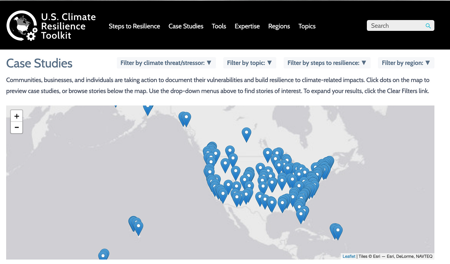
There are also case studies and tool kits from around the nation on how communities have worked toward resilience. Check out the site to see for yourself.
We all know from the news that “the government can’t do anything” and “every president fails, it’s just a matter of how and when.” But more people should know about projects like this. Seriously, spend time with this site — after you look at the turtle map.
Think globally; act locally.
That’s the explicit concluding message of the sea-turtle story map. It’s the implicit premise of this new site on mapping for Resiliency and Adaptation. Please check out these two sites for more.
The federal government has thousands of other sites that are collectively an incredible, under-appreciated modern treasure trove of information about our world. Crop trends; earthquake patterns; health-care access; stream-flow trends; sea-level rise; air-quality levels. The list is endless, and admirable.


