Mapping the Future: HEAT.gov
Your tax dollars at work, in an important and good way.
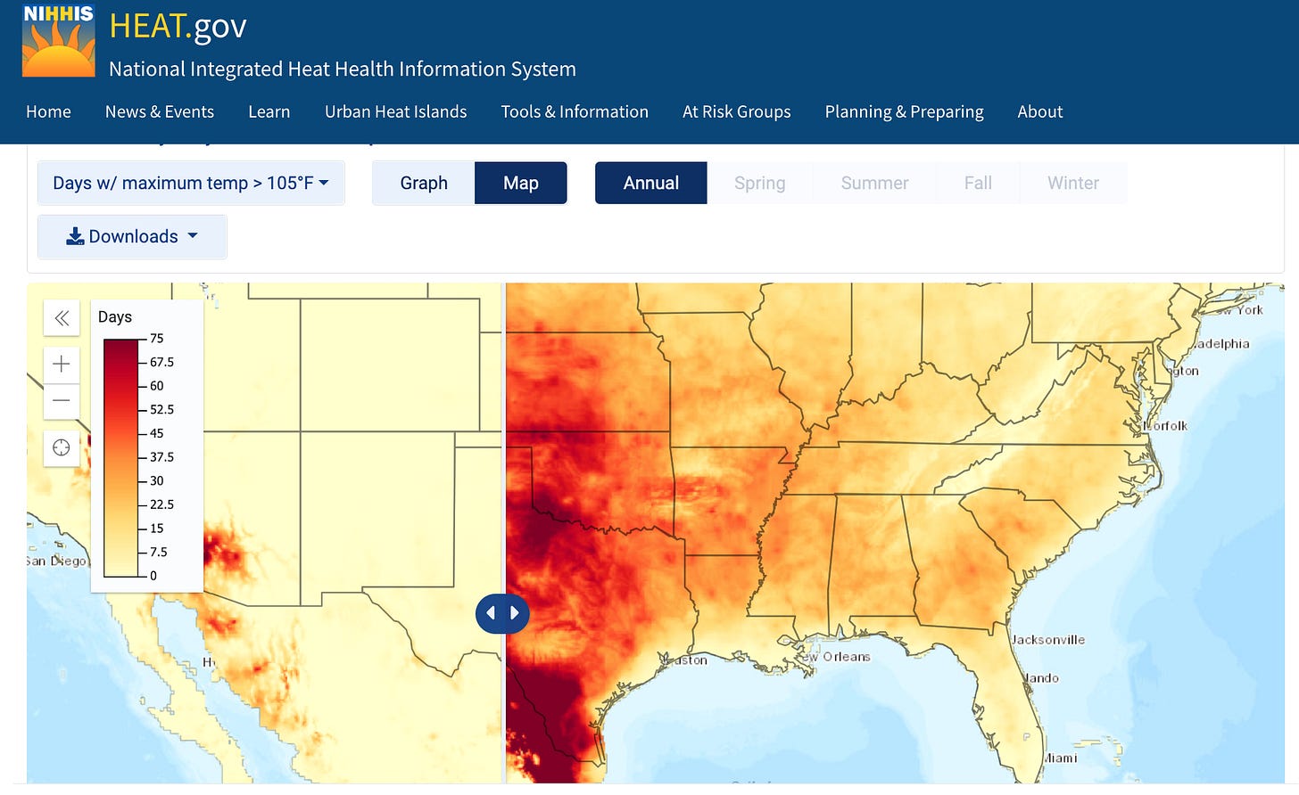
This post is about the news of this epoch: climate and sustainability, plus a new tool of this moment for envisioning and — who knows! — possibly doing more about these challenges. This post will be image-heavy, as opposed to text.
Intentionally, this is not about the news of this week—inflation, midterms, flounderings of the press, etc. Nor the news of this American generation—whether the U.S. governing model is running out of luck, or which American institutions have crumbled or by contrast shown new strength, or how the NYTs recent I was wrong… supplement should have been more broadly applied. I’ll get to these soon.
Today’s installment is a meant as a tech intro-and-update. It comes in the wake of the “astonishing” but still uncertain Biden-Schumer-Manchin apparent agreement to invest in national and global challenges, including climate. I’d like to talk about a new climate-related site called HEAT.gov and why it matters.
‘Mapping Common Ground’
A few words of background:
Earlier this month, my wife, Deb, and I, and our Our Towns colleague Ben Speggen joined some 15,000 other people at the annual User Conference in San Diego for the digital-mapping company Esri.
I’m a long-time admirer of Esri’s. The company was founded and is still run by decades-long family friends, Jack and Laura Dangermond. It is based in their (and my) inland-California home town of Redlands, and has transformed everything about life in that small community. Deb and I featured Esri and the Dangermonds in our HBO movie—including their explanation of why they decided to build what became a global tech giant not in Cambridge, where they had been studying, nor in Palo Alto, where the money was, but instead in the place where they grew up. I’ve written about them many times—including a note several years ago, when the Dangermonds made a historic $165 million land-preservation donation to save a crucial part of the California coast.
Have you ever noticed, on a map, where the California coast stops running east-to-west—as from Malibu to past Santa Barbara—and instead starts running north-and-south? That area is known as Point Conception, and it is of enormous ocean-and-land-based ecological significance. The vegetation is unusually rich, in this transition zone between northern and southern California. So is the wildlife. So is the sea life, where ocean currents collide and converge.
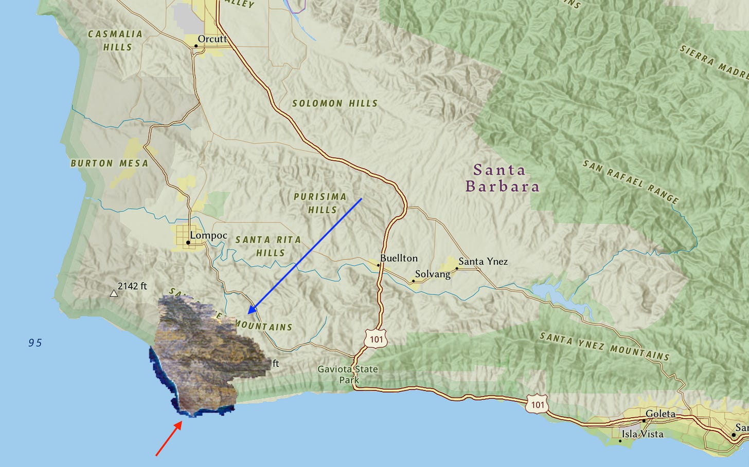
These are the 24,000 acres of vulnerable land that Jack and Laura Dangermond enabled The Nature Conservancy to protect as a permanent research site and nature preserve.
I think the company and the family have done a lot of good for the world. For instance: Esri’s mapping software, used on a for-pay basis by local and national governments everywhere and by countless corporations, is now offered free to K-12 schools any place on Earth, and most non-profit organizations. Esri created the software behind the phenomenally popular and influential global Covid dashboard and map, from Johns Hopkins university. The company and its staffers have been partners and supporters of ours in many ventures, especially in developing “geo-journalism.” The most recent illustration is an Esri “StoryMap” of Bucksport, Maine, which we published yesterday.
‘Think global,’ with new tools for ‘acting local.’
What we saw at this year’s User Conference was a concentrated application of mapping tools to dealing with climate and sustainability issues. The theme of the entire conference was “Mapping Common Ground.” The implication was that maps might offer a way to create a ground-truth—a shared, comprehensible reality even in an era of contending “facts.” The maps on display covered a wide range of topics, from economic inequality to the proper layout of train lines. I’d like to concentrate on those involving climate and sustainability.
At the conference, David Hayes, who has worked through his career on sustainability projects and is now the Biden White House’s advisor on climate policy, gave several presentations. It’s worth remembering the particular moment when he spoke: after the notorious Supreme Court decision limiting the EPA’s power over climate issues, but before this week’s Manchin/Schumer/Biden agreement.
In those parlous times, in a session that I emceed, Hayes reinforced the importance of local, statewide, and regional innovations for sustainability. But he also laid out the administration’s undeterred national agenda, as reported by Alex Woodie in Datanami:
Reducing U.S. greenhouse gas emissions by 50% below 2005 levels in 2030;
Reaching 100% carbon pollution-free electricity by 2035;
And achieving a net-zero emissions economy by 2050.
What, exactly, does all of this mean in practical terms? That is more than I can get into today. I can say that Hayes offered a preview of what promises to be a series of online maps and dashboards designed to give people a clearer, more comprehensible sense of: what is happening; how it will affect them; and what they can do.
In an excellent new article for Fast Company, Alex Pasternack discussed many of the map-based implications of the new White House programs, with examples. Let me give just a few illustrations from the first such climate-based public map the White House has released, HEAT.gov. The main points about all this and related “digital dashboards” (like the one for Covid) and maps:
They are customizable. You can see your immediate neighborhood, or the entire world.
They are configurable. You can see the “real” weather as of 2020, and the projected weather as of many decades from now.
They can be combined. You can overlay a map of likely future flood zones, with areas of greatest economic and social vulnerabilities.
What can these maps show us? Here is a very tiny “bailing the ocean” sample set:
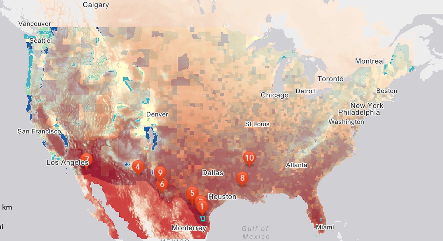
First, a map showing the priority list of communities most at risk from heat stress some decades from now. This is based on an overlay of likely future temperatures, with current resources and vulnerabilities, and other factors and trends.
Number one on this future vulnerability list is in the Rio Grande Valley of Texas. Number ten is in Arkansas. In between, at number seven, is my own home county in California. You can tune the map to your own interests here. It is meant to serve as a guide for preparation, avoidance, and resilience.
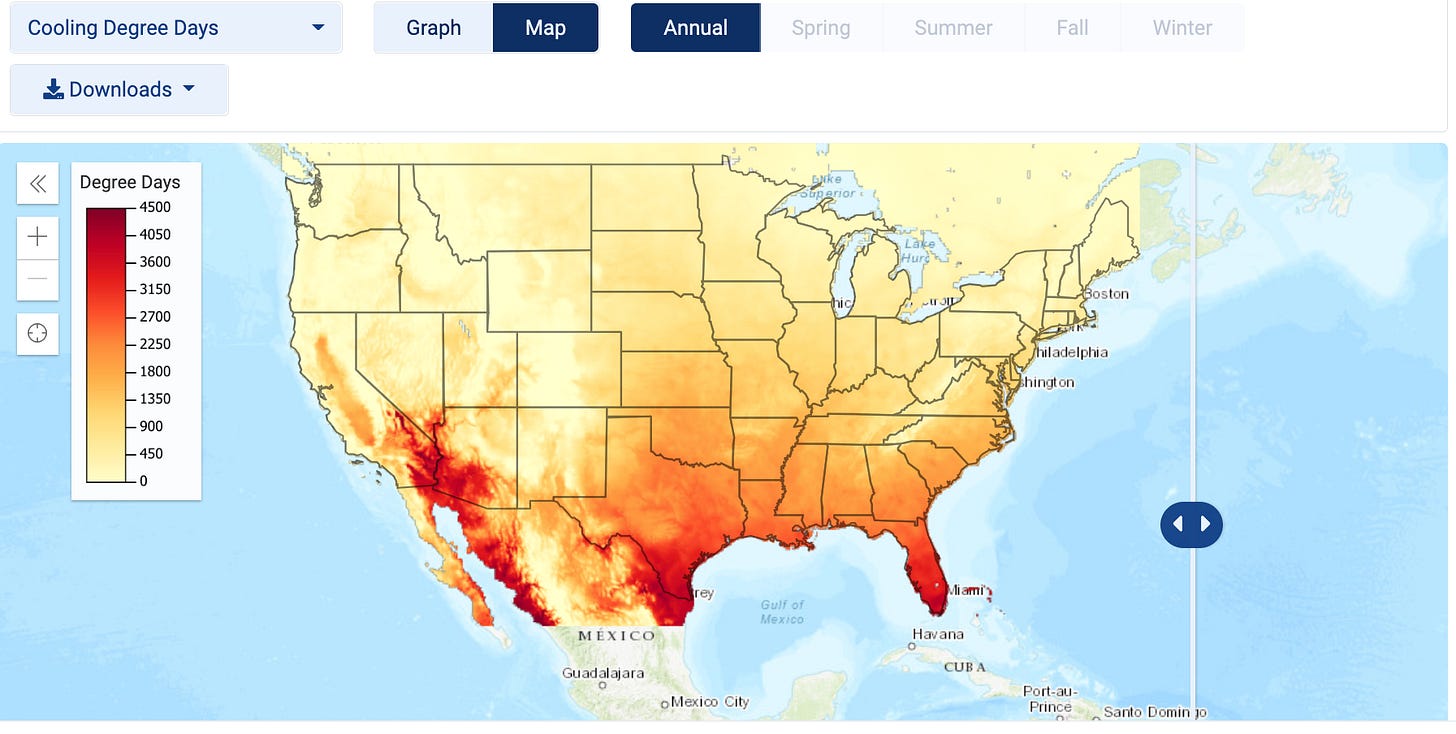
‘Cooling Days’, and more
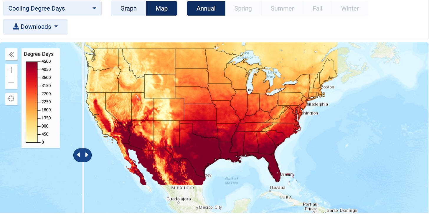
And here is a map of great importance to the electric-grid industry. It shows “cooling days,” or potential demand for air conditioning. First, the current level.
Then, by the end of this century:
The power grid will evolve to meet this challenge, or it will not.
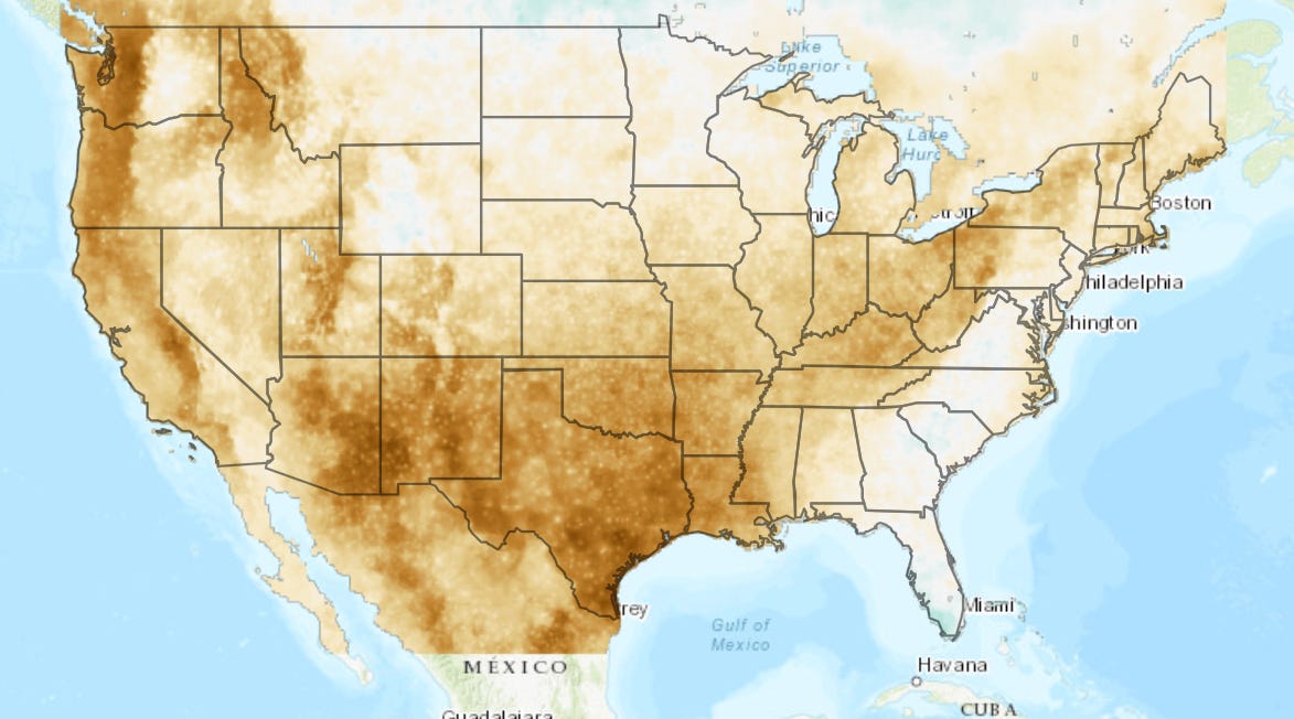
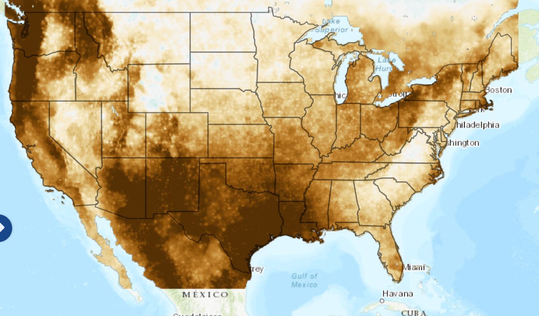
Similarly, here is a before-and-after set of maps about “dry days,” with consequences for agriculture, urban water supply, and much else.
First, current “dry days,” per year.
Then, by the end of the century:
There is a lot more to come — in terms of other portals that depict and explain the coming crisis, and that suggest most useful avenues for action. And there is a lot more to discuss.
For now let me suggest that you balance each minute you spend hearing about either Joe Manchin or Kyrsten Sinema, with two minutes on HEAT.gov. And gratitude to the public and private officials who are making this information accessible.


Reagan planted the "government IS the problem" seed in this country, and with it the conviction on the part of far too many citizens that government is incapable of anything but wasting our tax dollars and complicating our lives with inessential restrictions and red tape. Thanks so much for showing us just a few of the many extremely competent and helpful government programs and web tools that can help all of us plan for the future. Thanks also for reminding us to pay attention to climate change and treat it like the emergency that Greta Thunberg has been telling us for several years now that this is.
If you have any contacts on the Carbon Credits subject please let me know. Meanwhile I am reaching out to experts I know, including one we both most trust and admire, Susan Fallows Tierney a true expert on utility regulation and economic equity.